Accessibility Isn’t in the Cards
My five-year-old daughter and I are always the first two up in our house and we start each day with a couple of rounds of her favorite game... Uno.
Unfortunately, my red-green color deficiency makes distinguishing between the yellow and green cards in this game a difficult task, especially in less than ideal lighting. In fact, my five-year-old daughter has already gotten in the habit of letting me know whether a card is yellow or green whenever the color changes (and I'm fairly certain she's telling me the truth... most of the time).
Minecraft Uno and Contrast Ratios
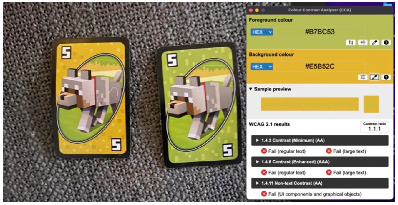
A yellow and green 5 from Minecraft Uno are shown side-by-side with the Colour Contrast Analyzer showing these cards only have a contrast ratio of 1.1:1, making it difficult (or impossible) for colorblind players to distinguish them from one another.
The designers for this game could have simply made the green darker and the yellow brighter to avoid any contrast issues. This adjustment would have made the deck accessible for those with color defiency without having a negative impact on anyone.
Designing for accessibility is designing for everyone to have a universally positive experience... even if their kid laughs uncontrollably while stacking Draw Two cards on them).
If you're designing a project and would like to know how your color contrast measures up to text and non-text accessibility standards, check out WebAIM's Contrast Checker.


